I collaborated with Charis Hospice to develop a new brand identity that would set them apart from other providers in the field. The goal was to create a look and feel that conveyed hope and serenity while avoiding the overly traditional or somber tones often associated with hospice care.
SELECT PROJECTS:
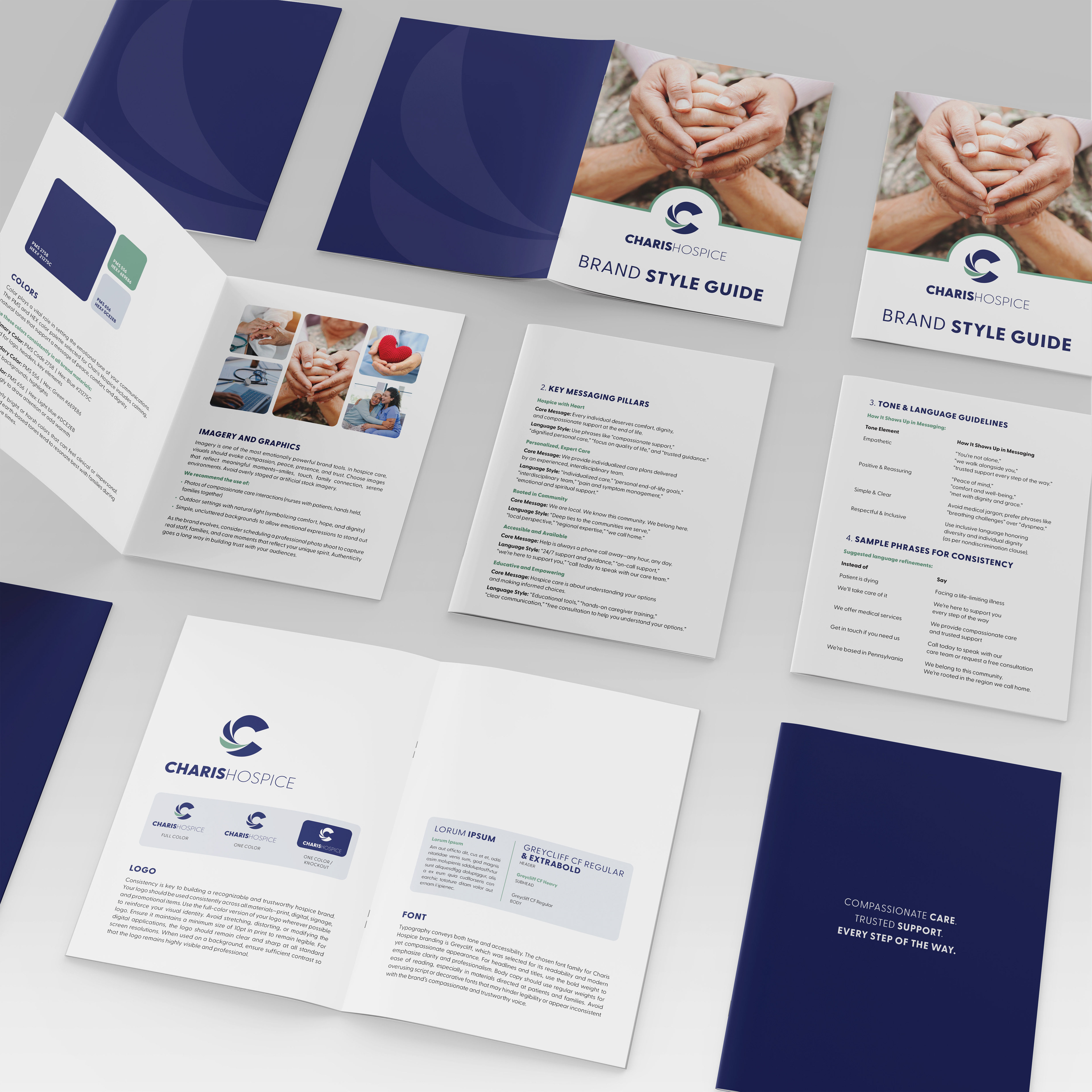
Brand Identity Development – Partnered with the client to create a distinctive new logo and visual identity. Included early logo sketches and color studies to demonstrate the evolution of the brand from initial concept through final execution, highlighting a thoughtful and collaborative design process. After multiple rounds of exploration, we focused on a wing motif—a symbol of care, freedom, and spiritual grace. Presented with a series of palettes that moved beyond the muted tones typical of the industry. The selected colors were designed to feel fresh, calm, and uplifting, expressing comfort and optimism while maintaining a professional tone. The final design balanced softness and strength, embodying the organization’s compassionate mission.
Brand Style Guide – Created a comprehensive guide outlining logo usage, color systems, typography, and imagery direction to ensure consistent application across all materials.
Collateral Suite – Designed a full stationery set including business cards, letterhead, and envelopes, as well as a trifold brochure to introduce the organization’s services and philosophy to patients and families.
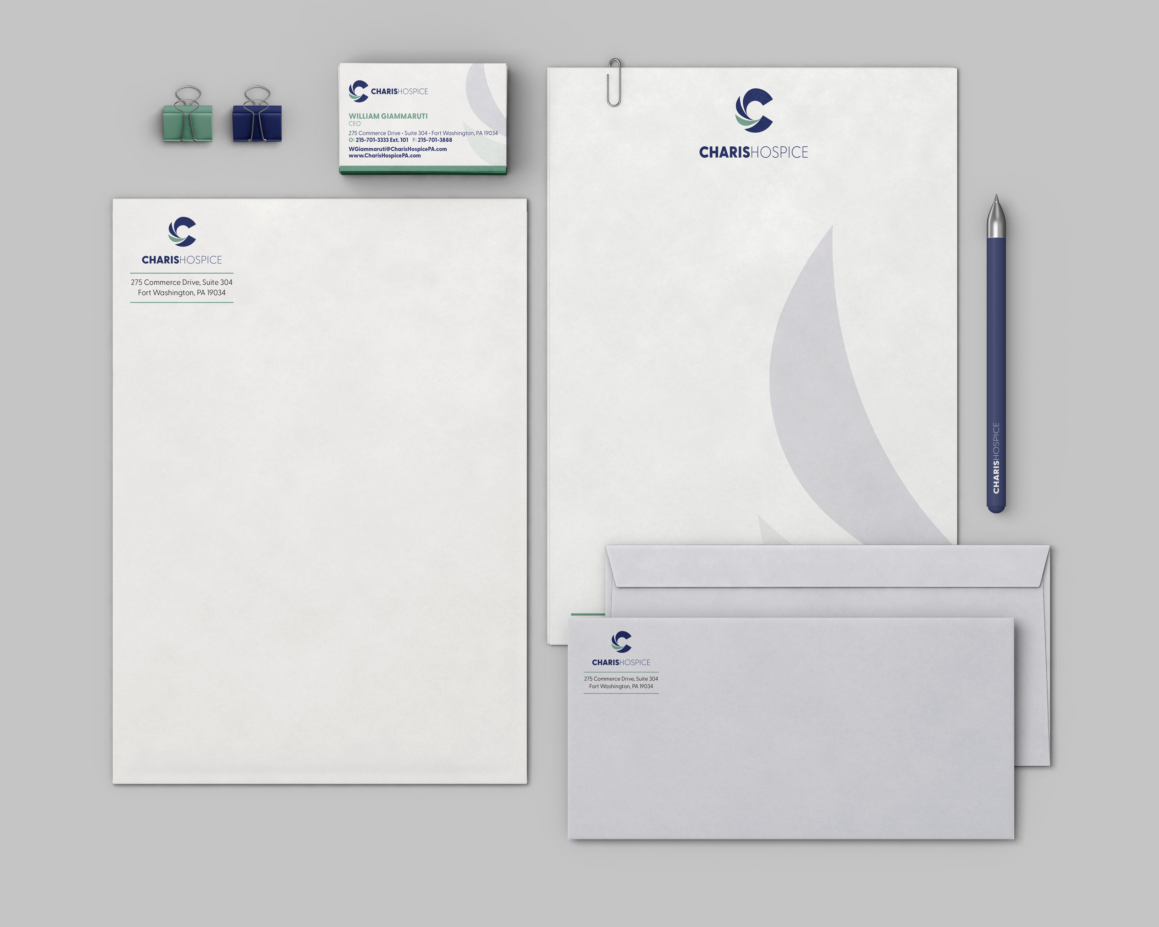
Collateral suite
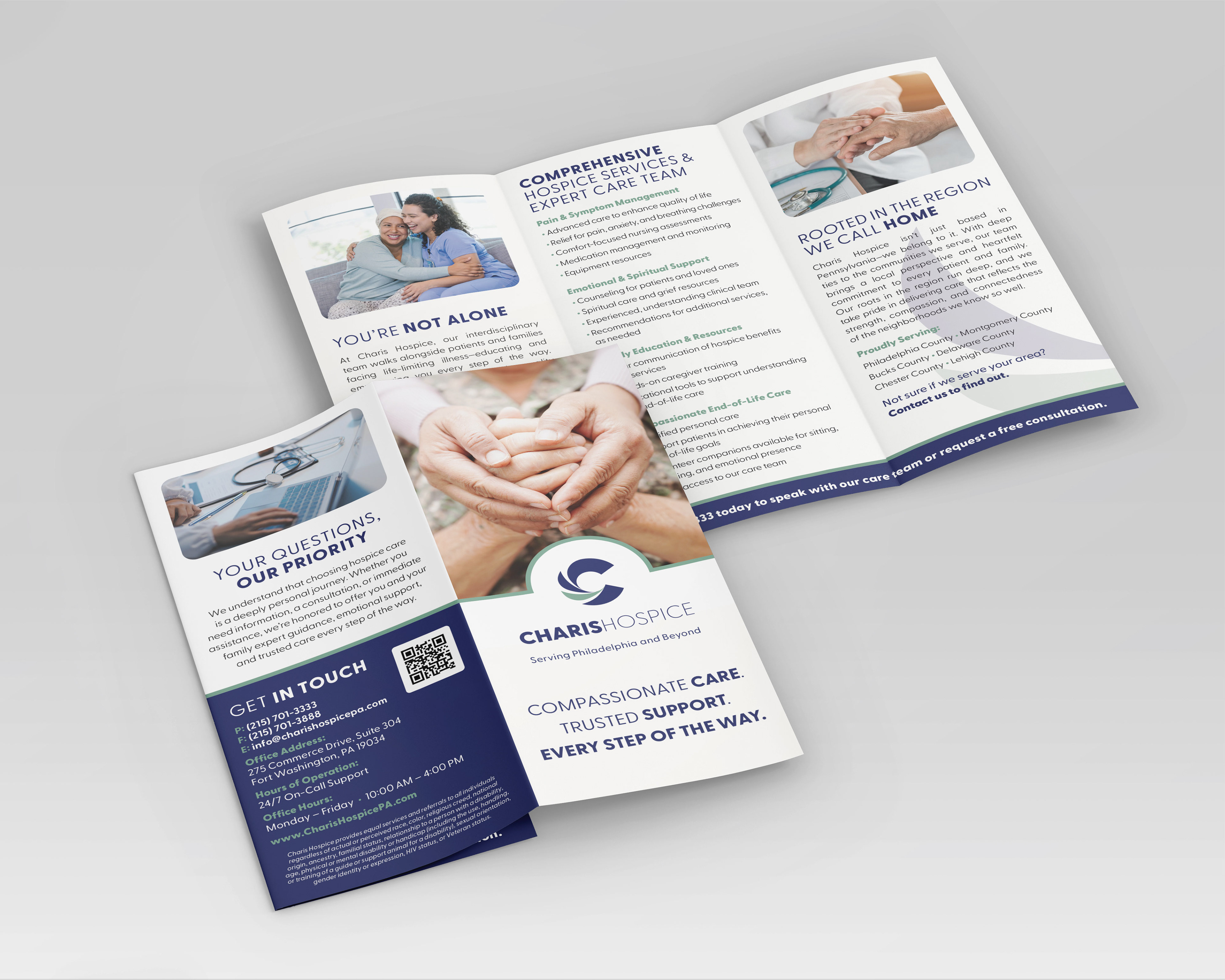
Trifold brochure